 The new logo for the 2012 Olympics has been launched accompanied by the customary list of contrived quotes about what it allegedly conveys to people. These always sound as daft as wine critics finding notes of rhubarb and spinach in a glass of plonk.
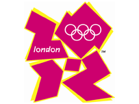
For instance, Tony Blair says, “When people see the new brand, we want them to be inspired to make a positive change in their life”. You can just imagine it, can’t you? “Gee, I was a career criminal addicted to drugs and no therapy ever worked. Then one day Tony Blair said here’s an innovative logo but all I could see was a pink and yellow psychadelic blur. That’s when I knew I had to make a positive change in my life.”
Jacques Rogge reckons, “This is a truly innovative brand logo that graphically captures the essence of the London 2012 Olympic Games… the brand launched today by London 2012 is, I believe, an early indication of the dynamism, modernity and inclusiveness with which London 2012 will leave its Olympic mark.” Come again, squire.
 Actually far from being innovative, this is brand-wank as usual, these quotes bearing all the hallmarks of PR consultants and not the sort of thing anyone believes for a nanosecond in the real world.
For the record, the logo reminds me of Fruit Salads, one of my favourite sweets as a kid, but not much to do with sport and still less all those other high ideals. Or is it just me?
UPDATE: Tony has just emailed me this alternative logo which seems good to me: